In Their Shoes
How suburban superstores are coming to a city near you.
Some say life is easier in the suburbs, but today, we’re seeing new retail designs that are finally giving cities their day in the sun when it comes to superstore convenience. What’s first on my list of favorites? The Target in downtown Chicago. One of the first things I noticed was that the design is customized for the location. I was even more excited when I saw the cute little sandwich shop, Pret a Manger, featuring natural foods and organic ingredients. No more terrible, cold pizza for lunch!
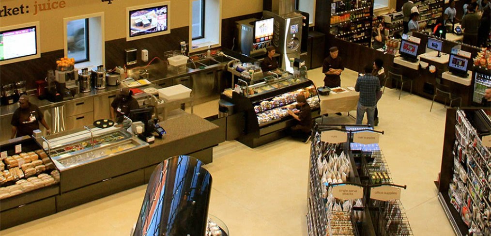
The number two spot on my list goes to Walgreens. Yes, that Walgreens; but this State Street location is not your typical drugstore. Again, the unique design is the first thing that caught my eye. The store also offers amenities like a self-serve ice cream bar. Although I must admit, our younger graphic designer, who clearly had her sights set on sweets, actually brought this feature to my attention. I was more focused on the two-story wine focal wall.
Both of these urban outposts prove that we need to know our customers and understand who we are designing for. Here in downtown Chicago, we’re looking for healthy, fast and compact. For example, we need items that are small enough to fit in a tote or briefcase because everyone commutes. As a designer, spaces like these remind me that when designing for a customer, patient or guest – especially on the other side of the world – we need to do our research and really put our feet in their shoes. What are their needs? What design aesthetic do they follow? What kind of shoes do they even wear? Just like at the Walgreens on State Street, I may prefer wine, but my target audience just might want a soft serve ice cream with sprinkles on top.
What examples have you seen of stores that are truly designed for their customers?
Cover image via Flickr (danxoneil)


Love this! Imagine what cities would become if everything were designed around what makes a people and a place unique?