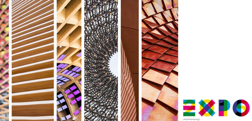
Exploring Expo Milano 2015
It’s been five years since the world came together to witness the biggest Universal Exposition in the event’s history. Held in Shanghai, the 2010 Expo welcomed a record 73 million visitors, with more than 240 participating countries and organisations.
One of the event’s most popular attractions was the British Pavilion designed by Heatherwick Studio. At its heart stood a 20 metre high ‘Seed Cathedral’ formed from 60,000 acrylic rods that encased tens of thousands of seeds to represent the potential of life and conservation from the Kew Gardens Millennium Seedbank Mission. The giant hairy cube was bold, creative and unique – even quite beautiful, and challenged our understanding of what is and what defines a pavilion.
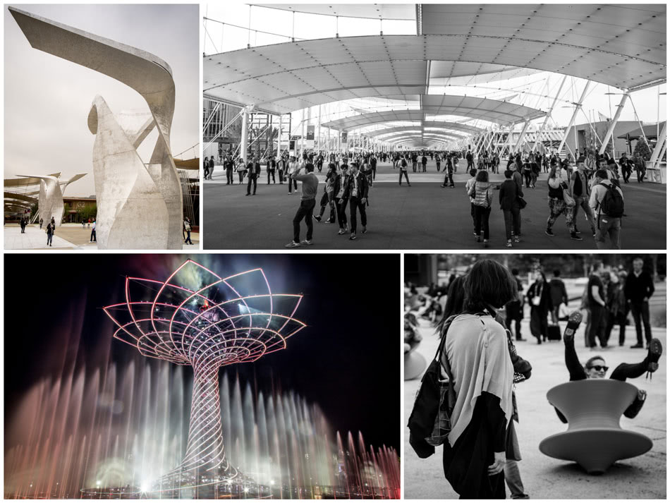
This year is Milan’s turn to host, with 145 participating countries ascending on the city to demonstrate how technology can offer concrete answers to a pivotal problem: namely, how to guarantee healthy, safe and sufficient food for everyone. And with many thought-provoking architectural statements on show throughout, this year’s showcase promises to be just as inspiring as the last.
“Feeding the Planet, Energy for Life” is the core theme of Expo Milano 2015 that aims to kick-start a global dialogue on hunger, obesity and food security. Some pavilions are more on-message than others, taking to heart the exhibition’s mission to contemplate the planet’s dwindling natural resources and to stimulate action. Others seem more focused on promoting tourism to off-the-beaten-path destinations.
The Expo’s layout reflects the geometric simplicity of a Roman-era street plan, with a 1.5-kilometre main avenue called the “Decumano” that crosses the site and provides views of each pavilion. Intersecting the Decumano is a 350-metre street called the Cardo that provides an axis between the host Italian pavilion, the Tree of Life sculpture and the Expo’s open-air theatre.
As a temporal architectural typology, the ‘pavilion’ lends itself to maximum flexibility and experimentation. Hence, when exploring the site, you often see a spectacle of novel forms, colours and claddings, all with the underlining theme of sustainability. Yet overall, it could be argued, there were few radical, innovative, experiential and sophisticated concepts. Below are the three national pavilions which, in my opinion, demonstrated the most successful experiential designs.
The United Arab Emirates Pavilion
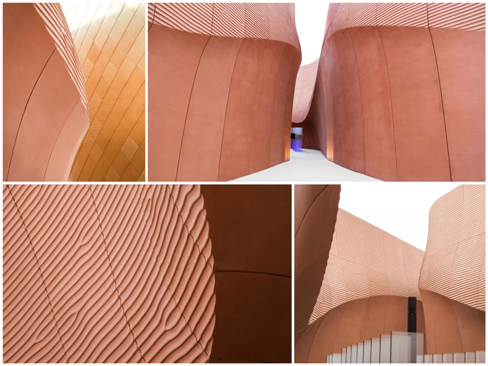
Designed by Foster + Partners, the UAE pavilion brings the planning principles of a traditional desert city to Milan. As described by the architect: “The design reflects our investigations into the form of ancient cities and our appreciation for the desert landscape. It also maximises the opportunities presented by the elongated site. The dramatic canyon-like entrance welcomes people inside, and the channels between the high walls provide intuitive circulation, naturally leading visitors to the auditorium, exhibition and courtyard spaces.”
This is a truly experiential building, where after taking a few steps into the canyon, it’s easy to disconnect from the rest of the expo and enjoy its elegant lines and simplicity of materials. The glass-fibre reinforced concrete panels are supported by a steel frame, which can be easily demounted and reconstructed for the pavilion’s eventual relocation to the UAE.
The United Kingdom Pavilion
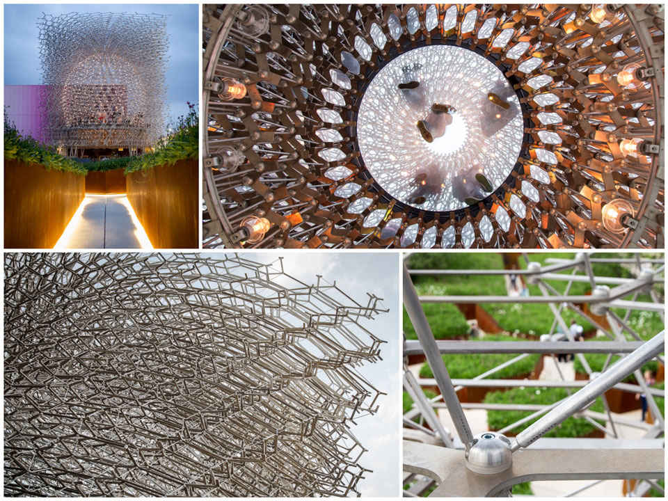
The United Kingdom Pavilion, designed by artist Wolfgang Buttress, once again challenges the conventional notion of what a pavilion should encompass by taking guests on a journey through a British meadow and into the “Hive”, a cuboid lattice that forms the centrepiece of the design.
Wolfgang wanted the structure to be incredibly delicate and light, enabling visitors to see right through it while at the same time feeling contained within the central sphere. Fundamental to the Hive concept is the spherical void in its centre, which allows people to walk inside and experience the sensory representation of the bees’ activity. The LED light fittings, embedded into the aluminium node components, glow and pulsate to represent the activity captured via an accelerometer within a real beehive located almost a thousand miles away in Nottingham, England.
The Brazilian Pavilion
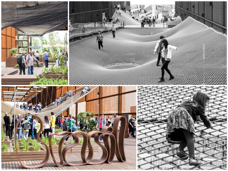
The Brazilian Pavilion by Studio Arthur Casas and Atelier Marko Brajovic is a truly original sensorial and fun immersion into a public square that floats and brings people together. As the architects describe it: “We aimed to combine architecture and scenography in order to provide visitors with an experience that would transmit Brazilian values and the aspirations of its agriculture and livestock farming according to the theme, ‘Feeding the world with solutions’”.
And it works! People really love this pavilion, and everybody walks out with a big smile on their faces after the experience. I wonder if we should integrate the word ‘fun’ into our designs more often…
Check out CallisonRTKL’s Facebook page for my other photos of the Expo Milano 2015.

