Bigger Isn’t Always Better
CRTKL’s Billy Plummer and Alfredo González discuss why big box retailers like Target are opting for smaller format stores in the age of online retail.
If you glance at today’s headlines, you might conclude that doomsday is near for retail. The classic American mall is dying. Online retailers are taking over. Corporations are announcing cuts. But while it’s true that the tides are a-changin’, retail has actually never been better. It’s just manifesting itself in ways we’ve never seen before, and as designers, we have to admit, it’s a pretty exciting time to be in our profession.
And, as retailers and designers feel out the modern shopping landscape, we’ve made a major discovery: when it comes to making big waves in store design, sometimes it pays to think small.
While not all retailers are embracing the idea, those that do are thriving. Take our client, Target, for example. Their new small format stores leverage the company’s brand personality and amplify their brand voice in an abridged location.
And we mean it when we say abridged. The new small stores land squarely in the 10,000 to 50,000-SF range—a massive downsizing when compared to Target’s average store size of 80-000 to 175,000-SF. But less size does not mean less profit. In fact, Target CEO Brian Cornell told Fortune that these new stores produce two to three times more sales per SF that the company average. Target and CRTKL have used a number of design elements to create a store format with a smaller footprint but an equally large cash flow.
Local Relevance
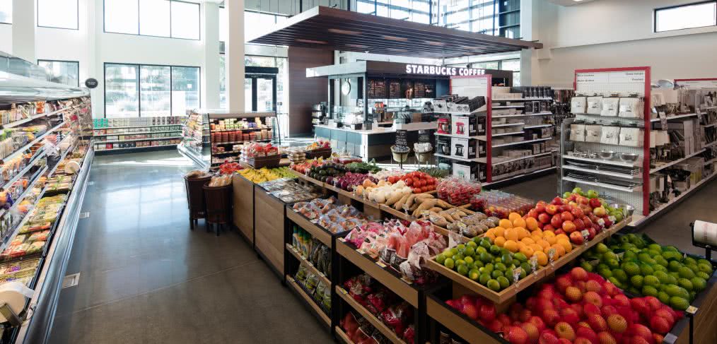
If you haven’t heard cries of, “Go local!” recently, then perhaps you’ve been living under a rock—but still probably a locally sourced one. Target is branching out from its big box outlook to capitalize on the growing desire for local relevance, especially among millennials. The new small format stores are designed to evoke a heavy sense of place. They use design elements from each specific neighborhood and feature work by local artisans. For instance, the small format store in Cupertino, California includes wood paneling and walls from trees native to the area, and at the Target on USC’s campus, you’ll find a wood-etched wall done by a local artist. Many of the stores are going into existing buildings, and some are even pieces of historic preservation.

Target (Cupertino, CA)
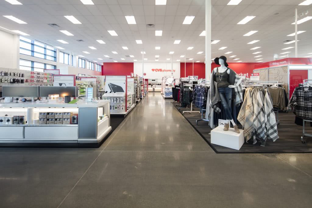
Target no longer wants to just enter a neighborhood; they want to become an integral part of the community. This also means tailoring each store to fit the area’s demographic and creating smaller, more curated spaces. The Cupertino small format store is sleek and modern, aiming to support the new Apple campus located down the street. But many of the small format stores are also located on college campuses. These stores tend to focus more on the needs of college students—ping pong balls next to the beer, grab-and-go items, phone chargers, smaller appliances, 6-roll packs of toilet paper. They also have a heavy campus focus, with gear for game day and branded college merchandise.
Experience
We are always looking for inimitable experiences. What is truly intriguing about the design of Target’s small format stores is that each is different and offers an experience that is unique to its context. In fact, these stores aren’t prototypical at all; you can’t just roll out the same concept in Manhattan as you did at a university in Texas.
For these new stores, the building often generates the layout. Some are three floors while others are one; they’re totally unique in size, shape and goods, meaning the design team has to think hard about each location, its community’s needs, the store’s design and the wares it will tout.
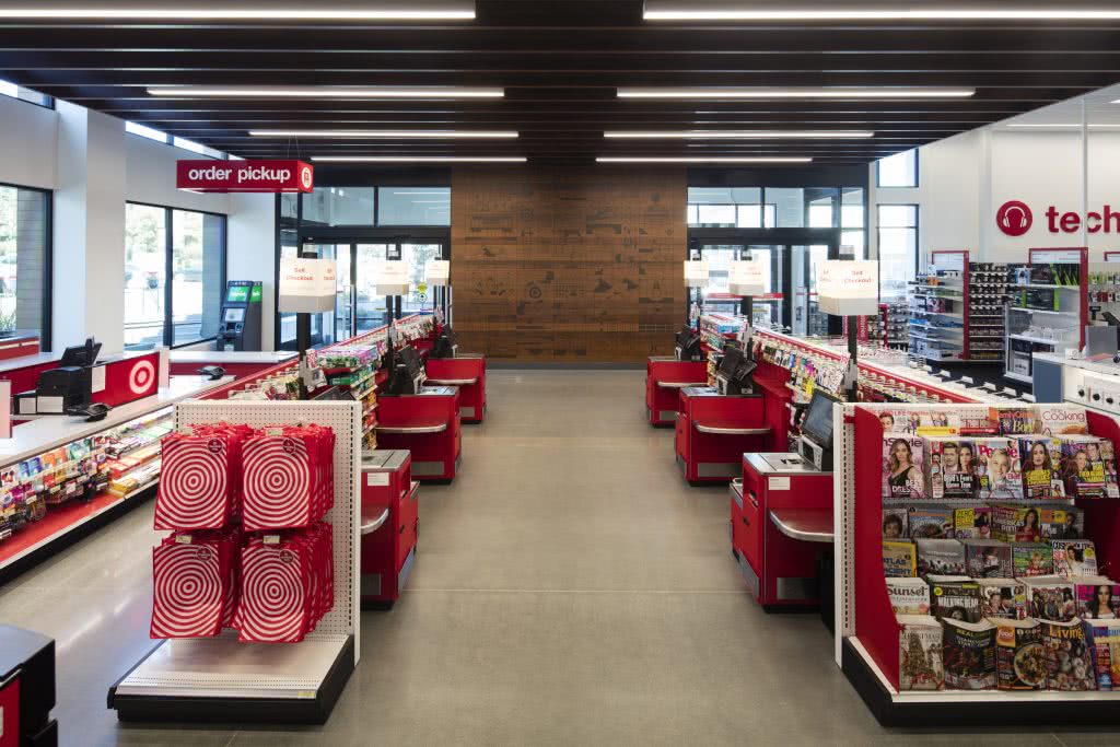
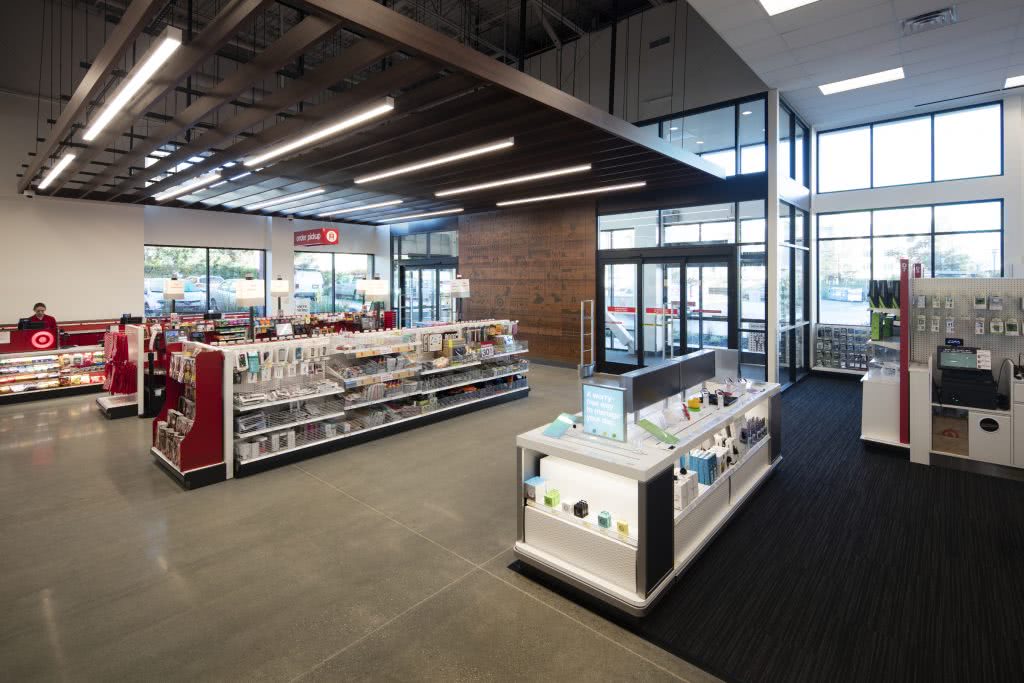
But it’s not all about shape and size. The new small format stores are clean, modern and easy-to-navigate, with end-cap presentations, aisle graphics and clear wayfinding. They produce a flawless experience from entrance to check out using updated tech and simple design.

Target (Cupertino, CA)
Convenience
Target’s flexible store design caters to urban living. The brand wants to catch the urban dweller who shops more frequently and for less bulky items—the young professional who pops into the store on the way home from happy hour, the mom who quickly swings through with her kids, the New Yorker with the tiny apartment, the daily shopper looking for fresh ingredients. It’s a different way of shopping, and that means it’s a different way of picking store locations. These stores are popping up close to public transportation and in highly populated areas. They aim to be walkable, convenient and designed for expediency.

Target (Cupertino, CA)
And they also capitalize on the online shopping revolution. Target says that about 75% of its customers start shopping on mobile devices. But brick-and-mortar stores still account for over 90% of the retailer’s sales. So, these small format stores now feature omni-channel options like ordering online and picking up in store. Target wants consumers to shop online, but they also want to entice them to make their way to the brick-and-mortar location, allowing them to compete with purely online retailers like Amazon.
