Guest Experience: A Lesson in Flexibility
This is the first in a series of exploratory posts by some of CallisonRTKL’s resident design experts on how design impacts the guest experience—from hotels to workplaces, retail stores, hospitals and everywhere in between—and the common elements and strategies we leverage to create spaces that are people-centric, experiential and memorable.
Designers are control freaks. Volume, proportion, color, texture, views—you name it, we like to control it. Rooted in the concept of “total art” born out of the Art Nouveau movement at the turn of the 20th century, the idea that every element of a space should be integrated into a coherent whole has dominated architectural practice ever since. Frank Lloyd Wright, for example, famously designed not only furniture but gowns and silverware for his clients because he couldn’t stomach another designer’s work compromising his overall vision.
Maybe we need to relax a little.
Some huge cultural shifts in the way people use the built environment are tearing across building typologies, geographies and demographics, and conversations at the proverbial watercooler reveal that designers at CallisonRTKL have taken note. The overarching theme emerging is the need for flexibility in the way spaces are designed and used, or, to borrow a phrase from Sir Alexander Gordon, “loose fit, long life, low energy.”
CULTURAL CONUNDRUMS: TECH AND THE OPEN LAYOUT
Many challenges present themselves in the quest for spaces that can stand the test of time. For one, our relationship to technology is changing as rapidly as technology itself. What’s trendy today is outdated tomorrow, and it seems we’re always finding new ways to make our spaces take care of us rather than the other way around. Smart refrigerators keep track of and order our groceries for us, while Siri and Alexa not only answer our random questions but serve as our personal assistants and stream music—and anything, really—on demand.
Further, the function of a space is loosening ties with its form as single-use spaces are dying out fast. Your great-grandmother’s kitchen, dining room, parlor and sewing room all had walls around them; today, one room is likely to accommodate all these uses, and more. This spatial integration isn’t just for space-saving or efficiency reasons, though that is certainly part of it. Rather, it is our need for social interaction, increased connectivity and—you guessed it—flexibility that is breaking down literal and figurative walls.
BLURRING THE LINES BETWEEN WORK, HOME, AND BEYOND
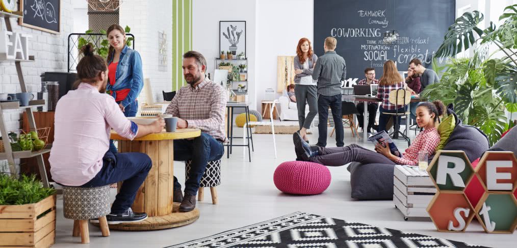
These two undercurrents collide most visibly in the world of work. Just as the old school phone booth and the traditional meeting room are rendered obsolete by the connectivity afforded us by Bluetooth and WiFi, the ubiquity of smart phones and laptops and the unrelenting pull to stay connected mean that we can, and do, work anywhere, anytime.
While work-life balance is still touted as the holy grail, the concept implies segregated time and space devoted to each. In reality, that’s not the way it’s playing out. The modern interpretation is much more nuanced, as evidenced in the on-going evolution of workplaces into something homier and homes that are increasingly accommodating for the remote worker.
This triumvirate of work, life and technology, coupled with cultural interests and societal norms, is proving itself a powerful change agent for human-centered architecture and design. It’s disrupting the look, feel, and spatial requirements of just about every space from hotel lobbies to retail stores; from family rooms to emergency rooms and corporate C-suites. And the more accommodating our spaces are to the multiplicity of demands that we all face, the better.

Great Post! Guest experience is such an important, and often overlooked aspect of building design.