Wai Kai at Hoakalei: A Heritage-Focused Approach to Modern Retail
CRTKL’s Marissa Pirog discusses branding, brochures and bringing botany into business.
Retail is more than shopping; it is about offering engaging spaces and unique experiences and providing a central location for community connection. As early as conceptualization, developers must consider retail strategy when enticing potential tenants to lease space in their development. In today’s competitive landscape, this is no easy feat. With this in mind, commercial retail developer Haseko turned to CallisonRTKL to meet this challenge head on by creating a compelling and authentic preliminary brand for their latest Hawai’ian development, Wai Kai at Hoakalei.
Our work with Haseko started as a request for a simple 11×17 leasing brochure for an early concept retail development just west of ‘Ewa Beach, O’ahu. The site location, a less-than-convenient 40 minutes from downtown Honolulu, posed special concern for the client who wanted to emphasize the alluring heritage and natural splendor of “the other side of the island.”
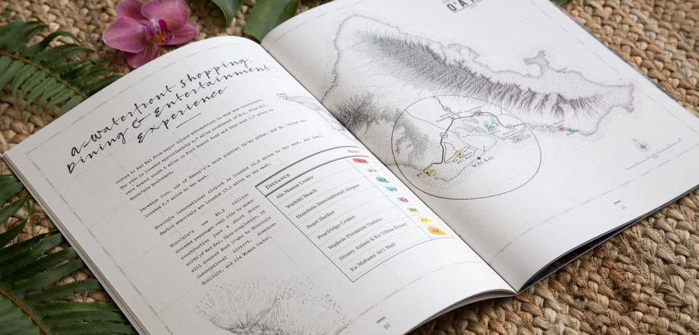
The client had previously prepared a similar document using another firm but was unhappy with the design, which felt corporate and unimaginative. Since the design of the site was at that point very conceptual, we agreed take a more organic, exploratory approach to the redesign, drawing inspiration from a botanist’s field journal. Ideally, we thought, the finished product should feel raw and personal, more like a found object than a glossy marketing brochure.
By incorporating toothy, off-white papers, blind debossing and calligraphic and type-writer fonts and by reducing the finished size of the document, we brought the whole project down to human scale. It fits comfortably in the hands of the prospective tenant, placing emphasis on the earthy details.
We styled the pages so photos look taped in, digital maps look one hundred years old, charts look drawn and inked, icons look like wax seals, and notes were hand-scrawled in margins. This, and more than twenty custom botanical illustrations of local flora, transport the viewer to a magical bygone place—harkening to the rich heritage of the site on ‘Ewa Beach.
With the 30-page journal printed and ready, we were asked to extend the vision for the journal to Wai Kai’s ICSC event booth. To compete for attention in the sea of exhibits at the conference, we translated the intentionally limited color palette of the book into a vibrant and dynamic environmental experience, leveraging site and botanical illustrations, graphic elements and copy from the journal on every surface of the space.
To conclude the project, we designed a complementary suite of printed stationery, including business cards, letterhead, envelopes and mailing labels for the client’s use in following up on tenant leads. These pieces held the essence of the journal’s aesthetic while creating a cohesive brand experience from first touch to last.
What started as a simple leasing brochure evolved into a preliminary definition of the brand for this retail project. By focusing on the spirit of the place, we articulated what makes Wai Kai at Hoakalei a one-of-a-kind destination.
In 2016, the Wai Kai leasing suite won an American Graphic Design Award in the Brochures and Collateral category.
