What’s in a Room?
How virtual reality and radical collaboration are transforming the way we design healthcare facilities.
In today’s healthcare environment, the patient room is more important than ever. As the setting where a patient spends a large part of their hospital stay, the layout, function, and comfort of the room are critical to both the healing process and the patient experience. Under the Affordable Care Act (ACA), hospital reimbursement rates are tied directly to the Hospital Consumer Assessment of Healthcare Providers and Systems (HCAHPS) survey that all adult inpatients must take, so the experience of staying in the room and the care provided directly impacts the cost of doing business for hospitals. Most importantly, well-designed rooms help encourage and enable better care behaviors from providers through efficient room layouts, accessible equipment and supplies and facilitates engaging patient interaction. Due to hospitals typically building patient rooms in units of up to 24-30 at a time over multiple floors, any inefficiency—whether clinical or facilities related—is magnified many times over. It’s no wonder that healthcare systems approach patient room design today with more care, introspection and user-involvement than ever before.
A New Room for Kennedy
At Kennedy Health, we showed how mixing the latest technology with a deeply collaborative client relationship can lead to the best possible patient room design.
In early 2016, Kennedy Health—a small but tight-knit community healthcare system in southern New Jersey—partnered with our design team at CallisonRTKL (CRTKL) to update their long-term strategic master plan and upgrade their facilities. Serving the community since 1965, Kennedy is comprised of three inpatient hospital campuses—Cherry Hill, Washington Township and Stratford—as well as a distributed network of physicians and outpatient facilities in the area. Despite the high level of care, quality staff, and strong leadership, the aging buildings and infrastructure needed to be modernized. For example, many of the existing beds at each of the campuses are in double and even multiple-occupancy rooms. This lack of privacy and standardization across the system has caused crowded units, varying levels of care and overall inefficiencies. Kennedy leadership was quick to acknowledge these challenges, and in turn, challenged CRTKL to help address them.
To begin the process, we formed a collaborative team of executives, both clinical and facility representatives, to conduct a predesign study before any capital building projects were identified. This year-long effort included interactive visioning sessions, programming exercises, facility tours and many discussions on the future of the system. This predesign study eventually resulted in a roadmap for development that identified both opportunities and challenges facing the system, defined and validated program needs, established priorities and goals and proposed the next steps for moving forward with this new vision. Central to that next phase of development were two new patient bed towers at the Cherry Hill and Washington Township campuses, scheduled to open in 2020 and 2021 respectively. These two projects would transform each campus by phasing out all existing double and multiple-occupancy patient rooms and establishing over 250 new single-occupancy rooms for the system.
The scale of this investment did not escape anyone on the Kennedy team, but it didn’t deter them either. With such a large number of new rooms planned, the design of the patient room was critical to the success of the entire initiative. The new room needs to be efficient, welcoming to millennials and baby boomers alike, and designed to promote a new shared standard of care across the system. It’s no small task, but both Kennedy and our CRTKL team agreed that the only way to succeed was through continuous dialogue and input from the hospital staff.
The steering committee was fresh off the year-long predesign study and invigorated by the collaborative process. They were able to extend this ethos even deeper into organizational efforts while creating a number of new user groups that included not just doctors and nurses, but clinical staff, technicians, housekeeping staff and facility representatives from all departments to play a role in the design. Throughout the early stages of the design process, our team met regularly with the user groups and steering committee to collaborate on the layout of the room through interactive planning sessions, hospital tours and virtual reality.
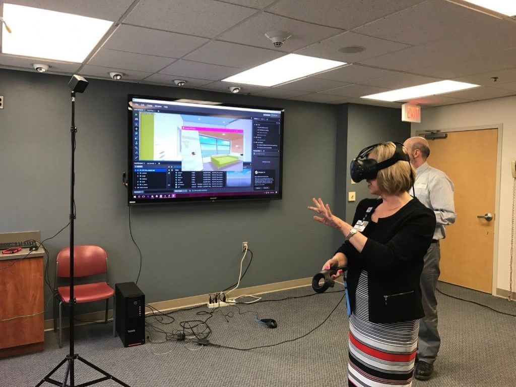
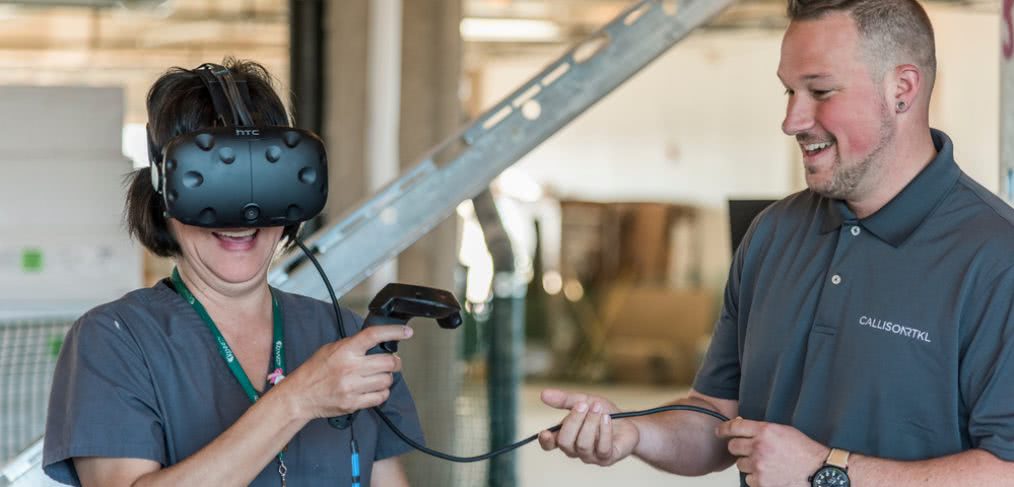
From the outset of the design process, our designers used virtual reality (VR) to aid in the design and presentation of the patient room. Using VR let the client and user groups walk through virtual models of the room and enabled them to better understand scale, layout, equipment location and other details earlier in the design process. One of the first major decisions facilitated by VR was between inboard, outboard, or mid-board toilet rooms in the acute care room. Being able to move around a full-scale virtual room allowed the staff to truly experience the difference in layout rather than trying to decide based on floor plans or renderings. A decision Kennedy was able to determine was that mid-board toilets offered the best combination of patient visibility from the nursing station in the hallway and a larger and more comfortable family zone with more natural light along the building exterior.
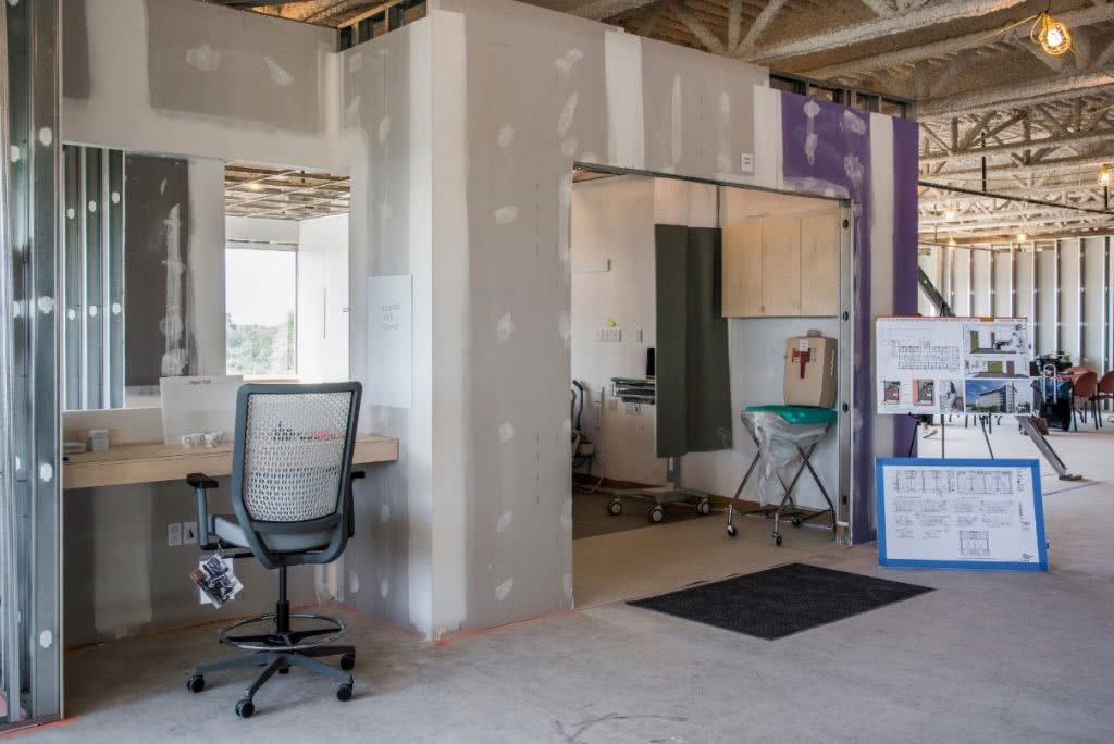
By the time the team moved into the design development phase, it seemed appropriate to test out the room design even further. Because of this early level of comfort – and excitement – with the design communicated by VR, Kennedy agreed that CRTKL would construct a physical mock-up of the patient room. Luckily for Kennedy, they had just opened a new lobby and medical office building at their Cherry Hill Campus, which would eventually connect to the new bed tower. This was the logical place to construct a mock-up, so Kennedy, CRTKL, and Norwood Construction built an acute care and critical care patient room on the fifth floor of the M.O.B. Although the rooms were “rough” (i.e., no interior finishes and minimal details), they were still full-scale versions of the room with plywood casework, real patient beds, recliners, sleeper sofas and a headwall with moveable outlets and equipment in the form of cardboard cut-outs. To complete the picture, a fully-rendered VR model of the room was set up between the two physical mock-ups, so the user could experience the room with all of the finishes, final equipment and furnishings represented.
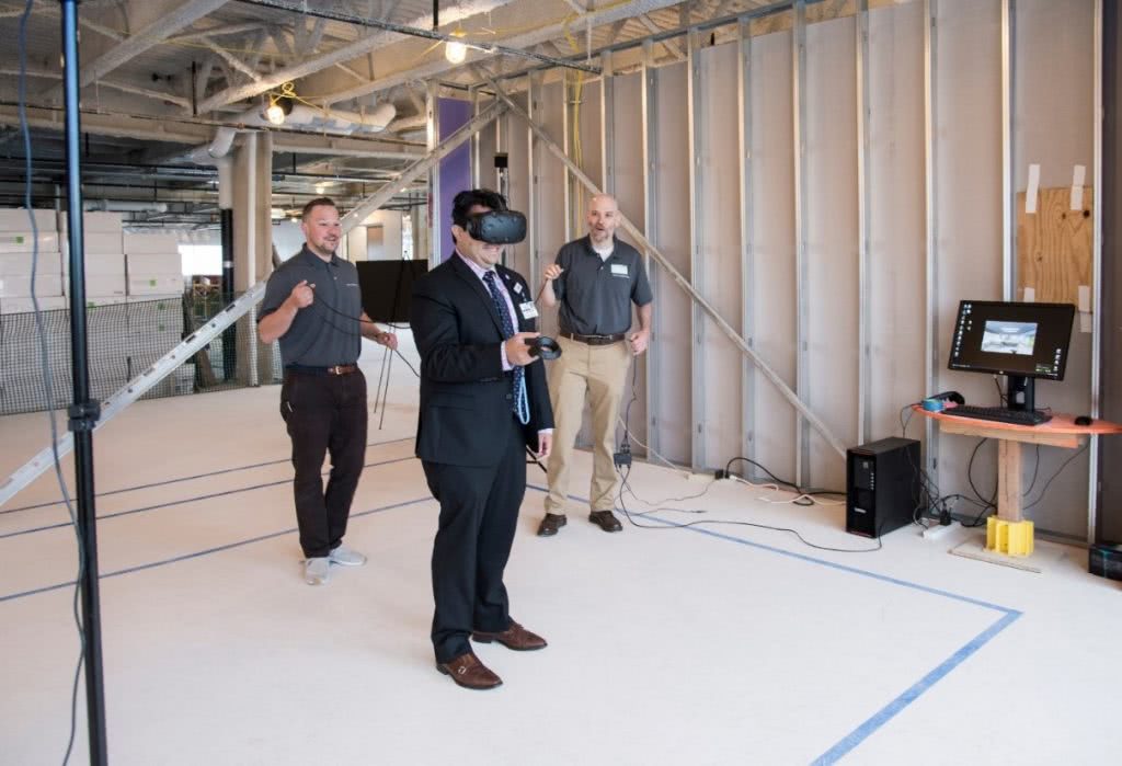
To further maximize the potential of the patient room mock-up, the CRTKL team organized a series of interactive tours for Kennedy staff. Over the course of a week, the team led over 150 staff members from all levels and departments through the two mock-up rooms. During the tours, the CRTKL team engaged each staff member about their current practices, how the design of the new room might affect or enable better outcomes and their preferences for room attributes and equipment placement. Whenever possible, the team had care providers walk through their routines in the mock-up rooms to test the new layout and functionality. A highlight of the week was when the critical care nursing team simulated a bed changeover with a room full of onlookers – stand-ins for the clinical team that typically accompanies a trauma team – to test room clearances and ensure an efficient path.
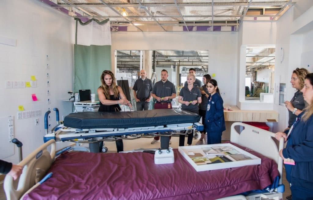
Each tour through the room was scheduled for an hour, and during that time, staff members from the hospital were able to talk about their experiences, rearrange equipment and leave notes throughout the room with suggestions and concerns. One particular item in focus was the patient headwall. Here, staff from all different departments were able to comment on the location, quantity, and mounting heights of outlets, medical gases and other wall-mounted equipment. This exercise was critical in designing a headwall that would maximize efficiency and standardize care procedures for all providers. After each tour, the notes were collected, recorded and the room was reset so the next group would start with the original baseline room layout.
Following the tour, each staff member was asked to complete a survey about the experience and any final comments or concerns regarding the room. The survey was brief but combined both quantitative and qualitative questions so the team could collect not only hard, comparable data, but also experiential and emotive feedback. For example, over 75 percent of survey respondents said that having a Workstation on Wheels (WOWs) permanently located in every room would ‘greatly’ or ‘vastly’ improve their current practice patterns. This is clearly a large investment for Kennedy, but one that is supported and desired by staff. In reference to the decentralized nurse charting alcoves located between each room, one user commented, “Love the workstations between rooms. This will keep nurses near the patient, provide a spot for documentation, and still be able to sit and give their feet a rest during the long days and nights.”
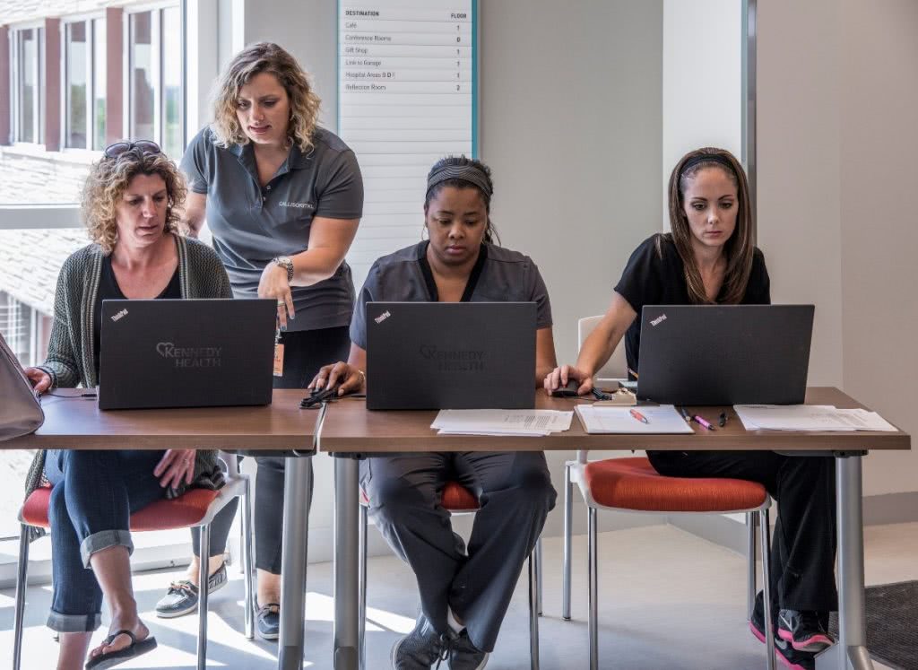
Initially, the mock-up tours were meant as an informational gathering exercise for the design team, but it quickly became apparent that it was so much more – not just for the CRTKL team, but for Kennedy as well. As the week went on, people who had not originally signed up for the tours began showing up. The word was spreading, and staff from all three campuses were eager to participate. Comments like “Thank you for allowing me to give my opinion on this very special part of our new hospital,” and “Looking forward to working in such an environment. Patient experience and staff morale are sure to improve…” became common responses in the survey. By committing to deep and continuous user engagement, Kennedy not only ensured a patient room designed to promote improved care practices but a shared vision among staff and caregivers.
In October of 2017, Kennedy Health was acquired by the Thomas Jefferson University Hospital system based out of Center City, Philadelphia and now operates under the Jefferson Health banner. However, as the two systems merged, it was clear that the leadership, commitment to improving care, and providing staff with an engaging and responsive place to work remains.
